Pyramid charts are graphical representations of data that form a pyramid shape. They are a great tool used for portraying a hierarchy of data separated into categories and subcategories. This article aims to bring you a deeper understanding of pyramid charts, their use cases, and how to create them effectively. Whether you’re a data analyst, a business professional, or just a curious learner, you’ll find this article informative and enlightening. Keep reading to discover more about pyramid charts.
The Concept of Pyramid Charts

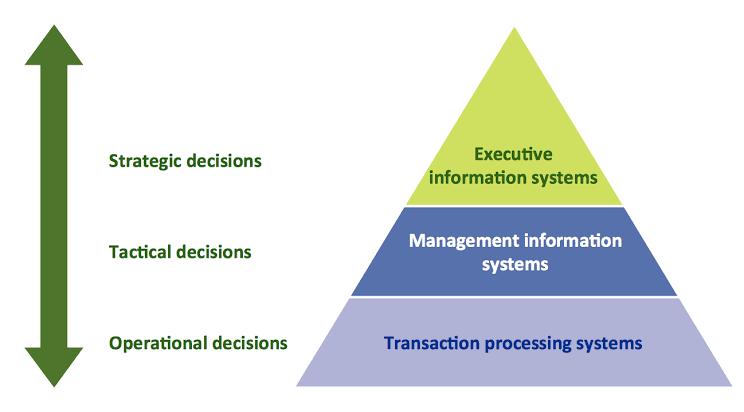
A pyramid chart is a type of diagram that takes the shape of a triangle or pyramid. The triangular shape is used to represent a hierarchy or progression, with the largest section at the base representing the largest amount of data or category. The sections reduce in size from the base to the apex, reflecting the decreasing size of each data set or subsystem.
Pyramid charts have found wide applications in various fields due to their ability to present complex data in a straightforward, comprehensible way. They are especially helpful in depicting hierarchies and cycles effectively. Additionally, pyramid charts are good at representing the distribution, composition, and correlation of data.
One notable feature of pyramid charts is their effectiveness in presenting population reports. For instance, to represent a country’s population data, you would usually find a pyramid chart useful. The different layers or segments of the pyramid will represent different age groups in the population, and the width of each layer will indicate the size of each age group.
The Importance of Pyramid Charts

Pyramid charts are important in several ways. Primarily, they help to simplify complex data, making it easier for the viewer to gauge relationships, proportions, and differences. The simplicity and effectiveness of pyramid charts make them a preferred choice for professionals in many areas, especially educators, corporate executives, researchers, and data scientists who need to represent data visually frequently.
By presenting data in a logical and cohesive manner, pyramid charts reveal patterns and trends that could have otherwise gone unnoticed. This valuable insight can guide the data-informed decision-making processes across various sectors, from finance and marketing to human resources and beyond.
Moreover, pyramid charts are excellent tools for data analysis. They are often utilized to disclose the hierarchical structure of an organization, detailing the roles, responsibilities, and relationships of each level of the hierarchy. By employing pyramid charts, you can have a clearer view of the working relationships among different components, enabling the seamless allocation of resources and duties.
Pyramid charts also provide a sense of aesthetics to data presentation. Unlike some other data representation tools, pyramid charts have a unique and attractive shape that piques the interest of viewers. Consequently, information presented in this way tends to be more engaging and easier to remember.
Components of a Pyramid Chart
A typical pyramid chart is made up of several parts. The base of the pyramid represents the foundation or largest data group, while the top of the pyramid represents the lowest level or smallest data group. The sections or layers in between represent other levels of data, with each level decreasing in size as it moves up the pyramid.
Labels are an essential part of a pyramid chart. Each segment of the pyramid should have a label indicating what the segment represents. These labels could include descriptions of data, percentages, and figures. The labels help the viewer understand exactly what data is being represented and how it correlates to the other data in the chart.
Color is another integral component of pyramid charts. Different colors or shades can be used to differentiate the various levels or segments in the pyramid. This fosters easy comprehension and adds aesthetic appeal to the chart. The color scheme chosen should be consistent and clear to make the chart easy to interpret.
Altogether, pyramid charts play a critical role in data visualization and interpretation. Whether you’re trying to represent a country’s population distribution, a food chain in an ecosystem, or a company’s hierarchy, pyramid charts can provide the clarity you need. So, improve your data visualization skills by mastering the art and science of pyramid chart creation. And remember, as with any tool, its effectiveness depends on how well it’s used. So, take time to understand your data and choose the appropriate chart type for its representation.