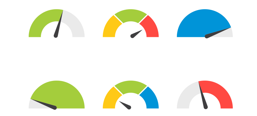
A gauge chart looks like a speedometer, with a needle that moves around a dial. It shows how a particular value compares to a set limit. The needle on the gauge chart moves around a dial to show how the particular value compares to the set limit. Gauge charts are often used to track things like sales goals, manufacturing quotas, or engine speeds. In this article, we’ll explore three uses for this simple, yet effective chart.
Monitor the Progress of a Project
A gauge chart is an effective way to monitor the progress of a project. They can help to identify any potential delays or problems early on so that they can be addressed and corrected. Additionally, a gauge chart can be used to help estimate the time it will take to complete the project and the progress of the team and ensure that everyone is on track. A gauge chart can also be used to track the progress of a project over time. The chart can be used to measure the progress of the project in terms of how close the project is to completion. The gauge chart can also be used to track the progress of the project in terms of how close the project is to meeting its goals. This chart can also be used to track the progress of the project in terms of how much money has been spent on the project.
Track the Number of Items Produced
A gauge chart is a great way to track the number of items produced. It can help you to stay on track and meet your production goals. A gauge chart can also help you to identify any potential production problems. By tracking the number of items produced, you can identify any patterns or trends that may need to be addressed. Lastly, a gauge chart can help you to improve your production process. By identifying areas where you can make improvements, you can streamline your production process and increase efficiency.
Compare Sales Completed to a Sales Target
A gauge chart compares sales completed to the sales target. It is a visual way to see if you are on track to reach your sales goal. Having a visual way to see if you’re on track for your sales goal is essential in business.
It’s essential to have a visual way to track your sales goals so you can stay on track. Having a goal without a way to track it is like having a destination without a map. You may get there, but it will be a lot more difficult and you’ll probably take a lot longer than if you had a map. The same is true for sales goals. You need to have a way to track them so you can make sure you’re on track and make any necessary adjustments.
Creating a Gauge Chart
When creating a gauge chart, it is important to choose the right variable to track. The variable should be one that is important to your research, and that changes quickly or slowly over time. It is also important to choose an appropriate scale for the gauge chart. The scale should be one that allows you to easily see the changes in the variable.
Once you have chosen the right variable to track, it is time to create your gauge chart. The first step is to create the chart’s background. The background should be a neutral colour, such as white or grey. Next, create the gauge chart’s frame. The frame should be a contrasting colour and should be large enough to fit the entire chart.
Next, add the gauge chart’s title. The title should be brief and should summarize the information that is displayed in the chart. Beneath the title, add a brief description of the chart. Now, it is time to add the actual data to the chart. Begin by adding the horizontal axis. The horizontal axis should display the time period that the data covers. Next, add the vertical axis. The vertical axis should display the value of the variable.
Finally, add the data points to the chart. The data points should be evenly spaced along the horizontal axis and should be positioned so that they fit within the frame of the chart.
Versatile Charts for Businesses
A gauge chart is an extremely versatile tool that can be used for a wide variety of purposes. Now that you know the three uses and how to use them, you can implement this handy chart in your business
